
Brand Identity, Logo Design
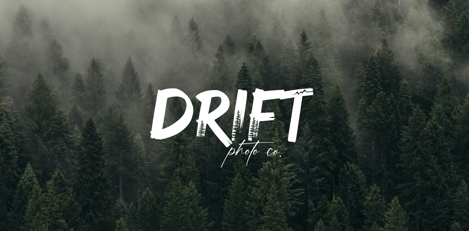
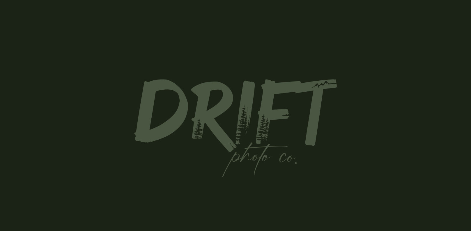
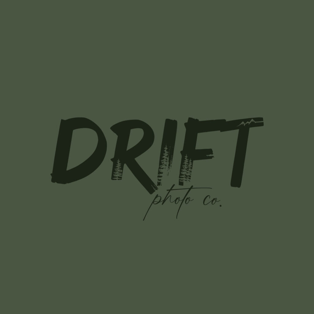
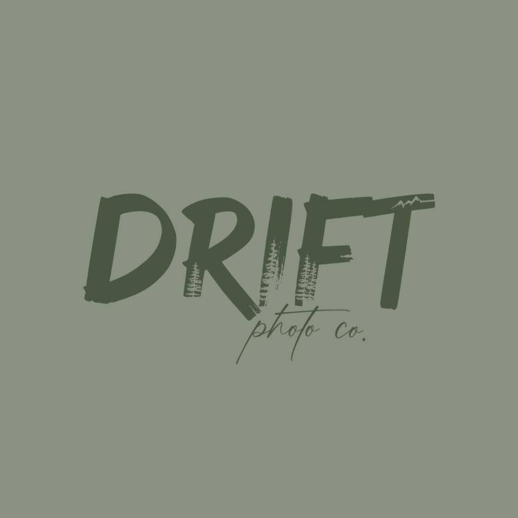
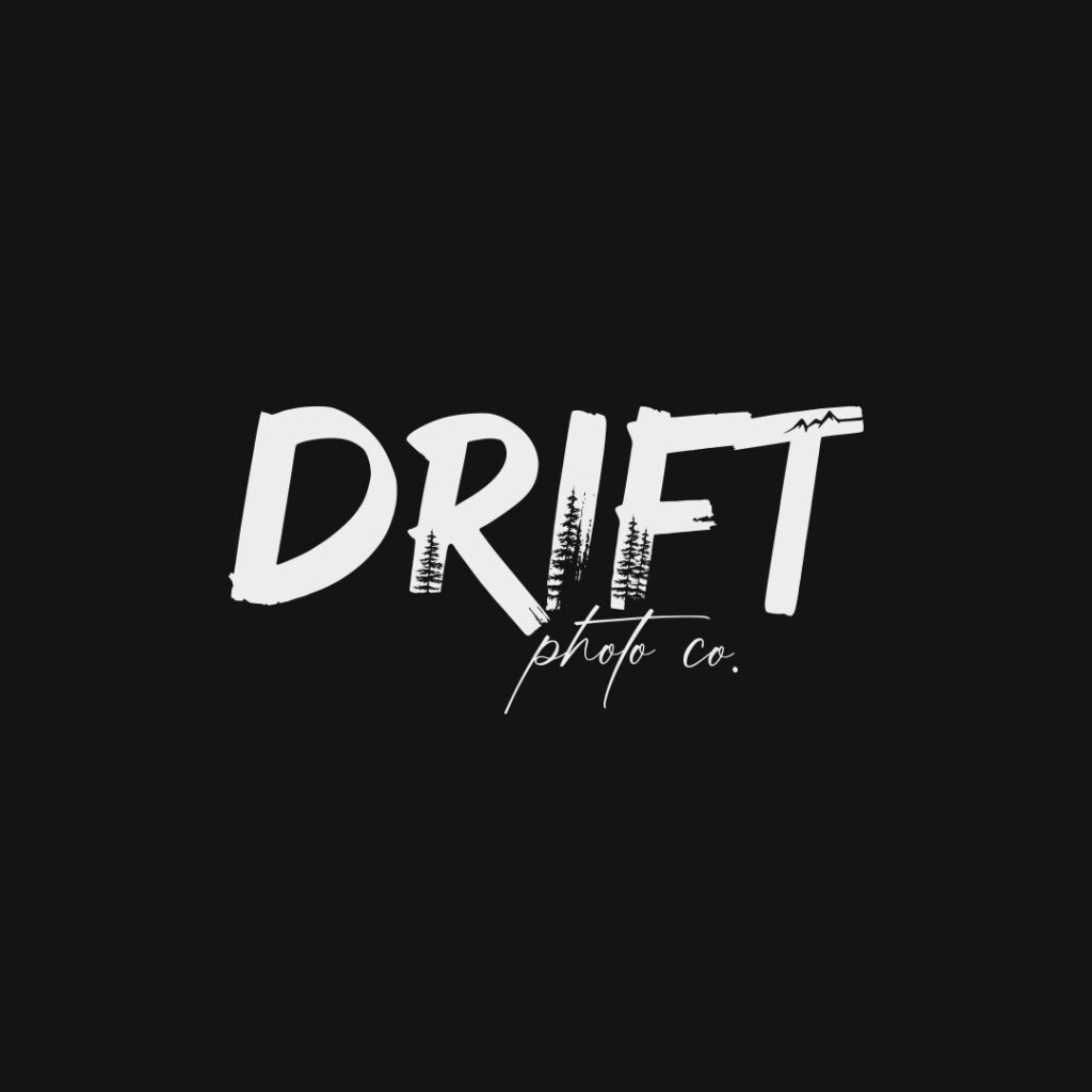
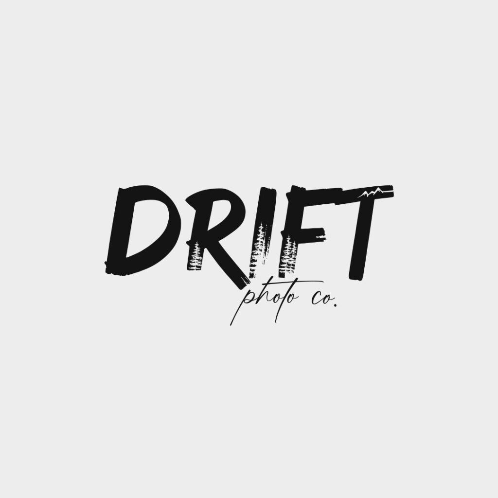
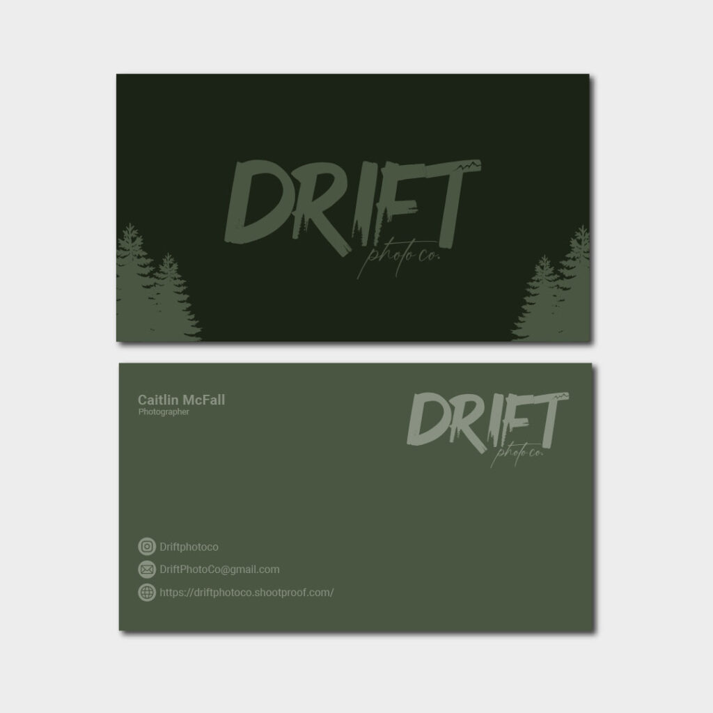
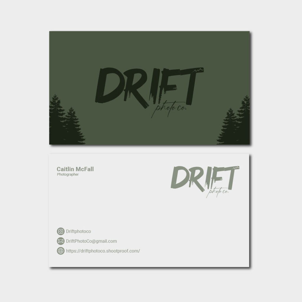
The logo features bold brush lettering that feels hand-crafted and spontaneous just like a moment caught in the wild. Within the letters, we subtly incorporated tree silhouettes to reflect the natural environment that defines the brand’s photography style. The rugged mountaintop line above the “T” reinforces the spirit of adventure, while the soft “photo co.” signature below adds a refined, personal touch
We wanted the branding to immediately evoke the outdoors and the photographer’s love for capturing life in motion. Through conversations with the client, we focused on themes like exploration, freedom, and authenticity, core values that helped shape the brand direction
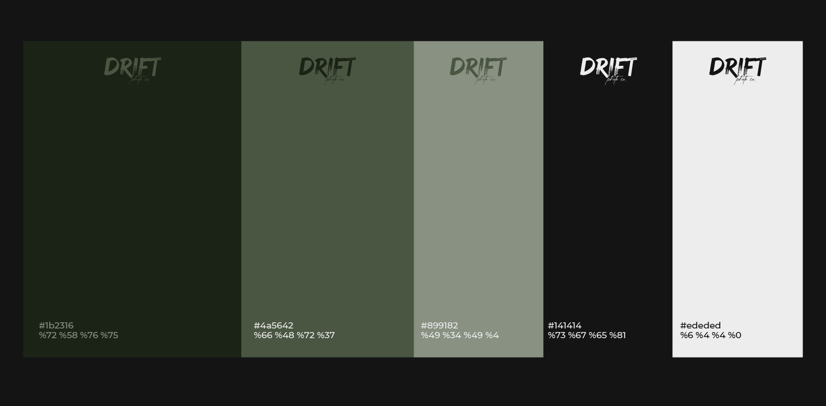
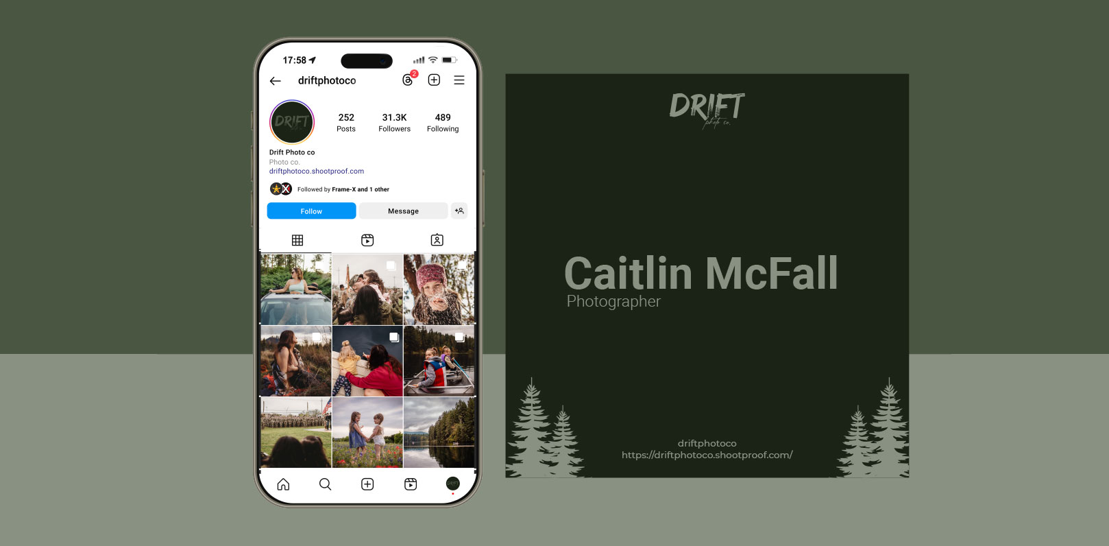
The final identity feels organic, bold, and versatile. It translates well across digital and print, and perfectly complements the moody, earthy photography style of Drift. Whether used as a watermark, on gear, or on social platforms, the brand identity helps Drift Photo Co. stand out and stay true to its roots.